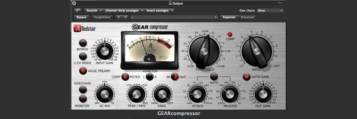
FlatUI – the “flat user interface” is directly opposed to the older Skeuomorphic interface design. Skeuomorphic interfaces look like “what they are,” they are realistic representations, such as a bookshelf for the iBooks App or a picture of a camera used as a camera button, calendar page, etc.
An interface with realistic representations of knobs and gauges:
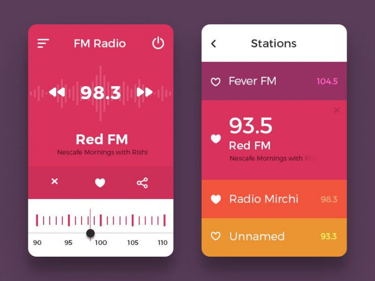
Flat UI doesn’t have shadows, it doesn’t have reflections. It’s flat. FlatUI uses simplified icons and simple colors. FlatUI is designed to work on tablets, PC’s, mobile devices and has clarity, rapid load times and streamlined, focused UX. FlatUI can be challenging for users if not carefully designed.
A completely flattened, radio interface:
Microsoft started flattening its UI’s with the introduction of the ZuneHD in 2009 and continued with all product lines. Apple’s iPhone finally went flat ui in September 2013.


0 Comments