Pops Royalty

This is what I was given
A 1940s dingbat with a couple oil derricks. Along with a couple pages of website text and a reply form.
Backstory
A multigenerational family had inherited Oklahoma oil rights. The grandfather of the family “Pops” had created a sophisticated paper system for managing oil royalties and ran a company doing so. and one member had written a software program, used by the family and friends.
This accounting system was now a software program they wanted to sell.
Task
Create a website and a logo that will help sell this software program.

Research
Upon interviewing the client, it was discovered:
- Photos and documents of Pops from frontier Oklahoma
- Extremely diverse users because anyone can inherit mineral rights
- Much of the target audience are older, conservative farmers and ranchers
- My budget was very small
Solution
Changing the product name from “Pops oil and mineral royalty management program” to “Pops Royalty”
- A logo inspired a 1940 Oklahoma gas station road signs.
- A Skeuomorphic pressed metal oval
- A new retro font called Lobster.
- Referencing fossil fuels
- freedom of mobility
- nostalgia
- accessible and understandable iconography.
Conceptualized a faux bottle of “frontier miracle cure/snake oil” with a goofy ironic vintage label.
- Developed a backstory for grandpa “Pops” and a style sheet
- Software is a cure all for the painful complexity of royalties
- 1930s and 1940s faded colors, deco fonts
- Wide open spaces with vintage mobility: cars, motorcycles, planes.
- Medical allusions
- Dust, faded paper, farm and cowboy and drugstore themes
Result
Despite fears that this might insult the family, the reception was overwhelmingly positive.
The result has been a long-term relationship producing all kinds of marketing and media as well as systems analysis
Pops Logo Flat Vector 2016

Dash Theme Selection jan 17

Naro Ad #3 Debbie 20160219_FINAL.1 copy

Related Star o Pops v5

NARO PA- sq v5

Artboard 1

ASSORTED

pops radio

Pops Documentation Cover

Pops-BCard-Back-v1

Prefs Panel

Treat-NaroNews-v1 PNG copy

View Title Detail Brown
Kutz No Risk 271px

NARO Web ad 4 v3 copy

Main-Slides-1-PSD

NARO-Brochure_Inside-v2

Pops4 enterprise vs desktop 3.3

Buffums Theme
Pops desktop lease data panel, Buffums style, 1940s department store colors

Dash-History-Recents subtab
Pops iPad – dashboard with history tabs open to “Recently viewed”
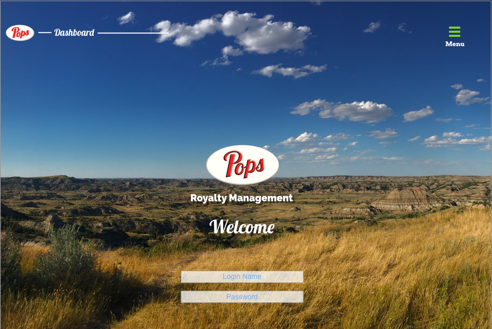
Dash-Login
Pops iPad. Login page with landscape background.

Screen Shot 2020-10-17 at 9.43.18 AM
Pops version 4, landing page concept, rocketship, cartoon in night sky with translucent text boxes